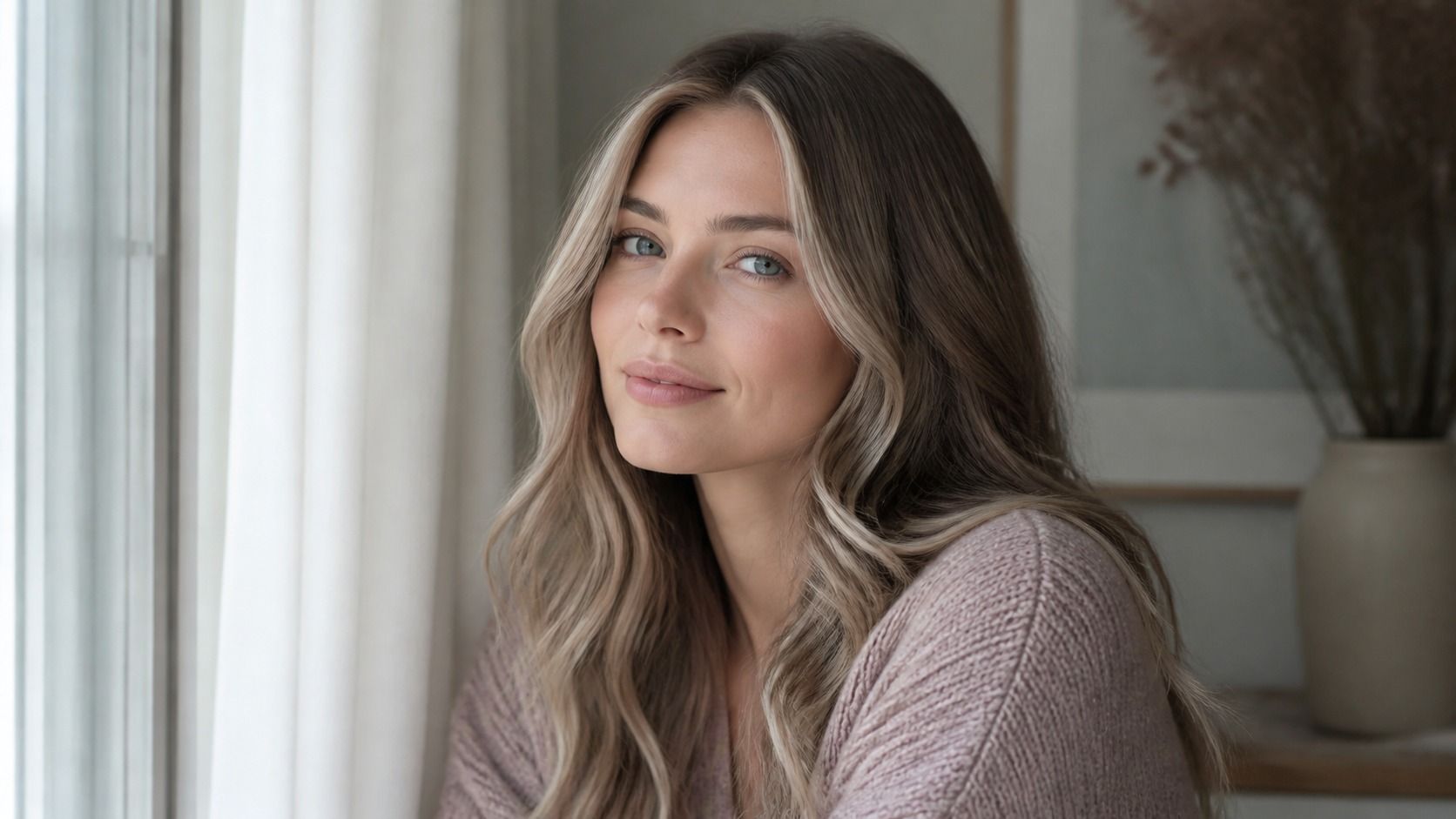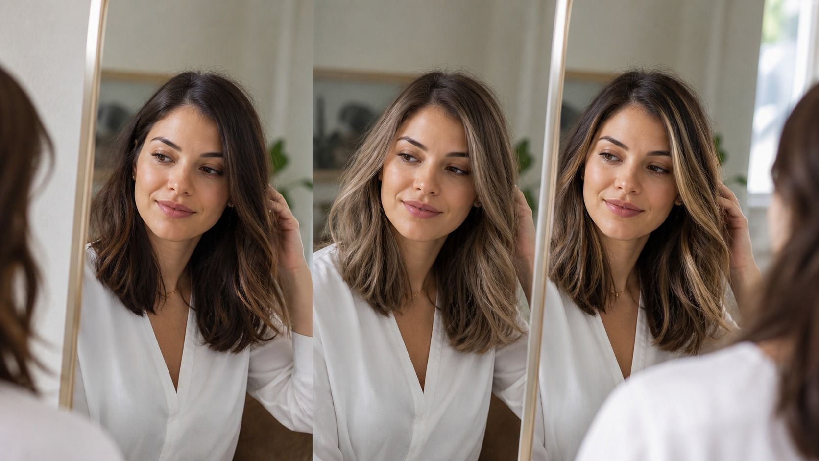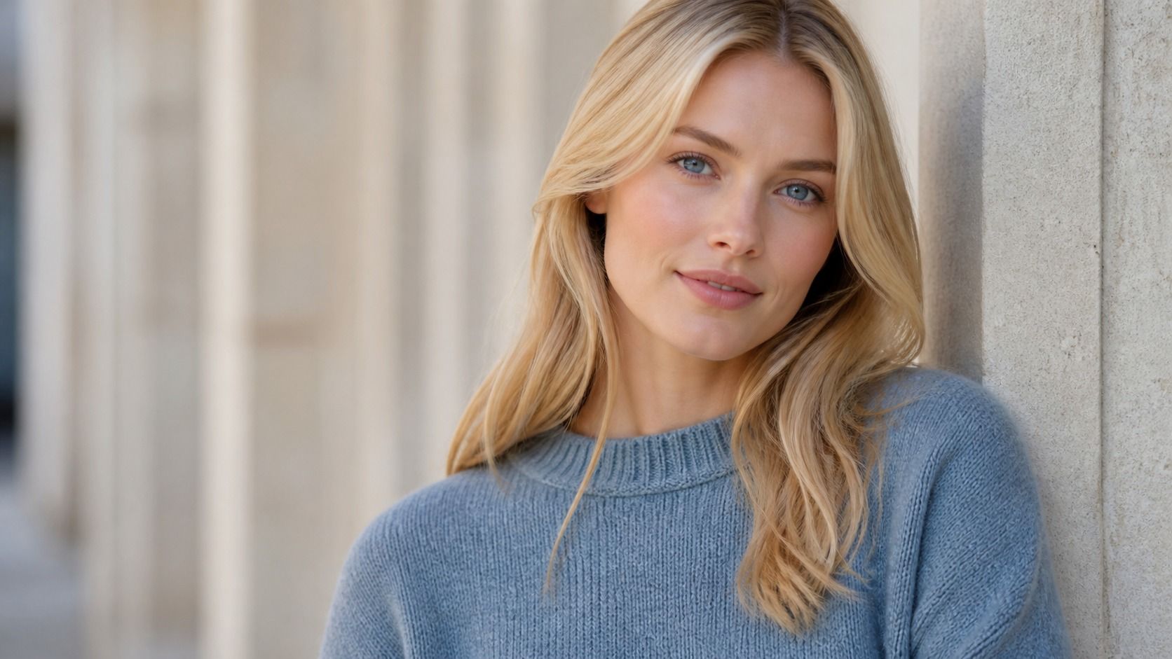
A virtual hair colour try on can save you from bringing a wildly misleading screenshot to the salon, but it only has one honest source of information: your photo. If the light turns your skin orange, the camera erases your roots, or a beauty filter smooths away every shadow, the preview starts from fiction. A plain photo taken near a window usually beats a polished selfie taken under bathroom lights.
Start with the decision you are trying to make
Before taking anything, decide whether you are comparing warmth, depth, or a dramatic change. A virtual hair color try on is quite good at showing the difference between soft caramel and cooler mushroom brown when the rest of the face is stable. It is much less convincing when you ask it to turn a deep brunette into icy platinum and then treat the result as a salon plan. Those are different questions.
Use daylight, but do not hunt for perfect sunshine
Stand facing a window in open shade or on a bright overcast day. The useful part is the broad, even light, not the sun itself. Direct midday sun creates hard highlights on the forehead and bright strips in the hair, so a dark blonde can read as gold in one place and almost black in another. A north-facing window often gives a quieter result, though any window works if sunlight is not hitting your face directly.
Keep the window about an arm's length in front of you. If it is far to one side, one cheek becomes cool and the other warm, which can make a virtual preview choose a strange compromise. Turn off the ceiling light and the mirror bulbs. Mixed lighting is the common culprit behind a photo that looks normal to your eyes but has a greenish or yellow cast in the camera roll.
Do one quick check before you upload. Look at the whites of your eyes and at a white sheet of paper held near your chin. If both look yellow, blue, or pink, change position or wait for steadier light. You do not need studio equipment. You need a photo whose colour cast is boring enough that the app has nothing to exaggerate.
Let the camera see the face it is meant to match
Use the rear camera if someone can help, because it normally gives a less distorted portrait than a close front-camera selfie. If you are alone, place the phone at eye level and step back rather than holding it against your face. Wide-angle lenses enlarge the centre of the face and can alter the apparent balance between a pale forehead, cheek colour, and dark hairline. That changes how a proposed shade feels.
Keep your head level and look straight ahead. A tilted chin hides the root area at the crown; hair swept across one eye hides contrast that matters when you are comparing lightness. Pull nothing tightly back unless that is the area you want to inspect. Loose hair with its ordinary parting is more revealing than a perfect blowout, because the preview can follow the direction and density you actually live with on an average weekday.
Glasses are fine if you always wear them, but take a second photo without them. Thick black frames can make a pale ash shade seem stronger than it will look once the glasses come off. The same applies to statement earrings and a scarlet lipstick. Keep the first image deliberately unremarkable, then make a second one with your normal styling if you want to see the finished effect.
Switch off filters before they quietly rewrite your colouring
Portrait mode is not always a problem, but skin smoothing, contour effects, face reshaping, and automatic beauty settings are. A filter that warms the skin by a small amount can turn neutral brown into a dull grey in comparison. Another filter may deepen the lashes and brows, making a blonde preview look more balanced than it would on a bare face. The mistake is subtle because the edited image still looks like you.
Open the original image rather than a version saved through a social app. Avoid preset edits labelled warm, golden, vivid, or cinematic. Reduce nothing unless the exposure is clearly wrong. A slightly imperfect photo is preferable to one where every shadow has been lifted and every red tone has been softened into beige.
White balance deserves a moment of suspicion. Phone cameras often correct a warm room by cooling the entire frame, then compensate again when hair fills much of the image. If your natural brown looks ashier in the photo than it does in the mirror, take another image near the window rather than trying to repair it with sliders. The virtual hair colour try on can only build on the pixels it receives.
Show the roots, hairline, and real texture
For colour decisions, the first centimetre of growth is useful evidence. Natural roots show the depth your brows and skin have already learned to live with. Dyed ends can be warmer, porous, faded, or simply darker from old colour layers. Part the hair where you normally part it and let enough of the scalp-side colour show. A preview pasted over a blurred curtain of hair may look smooth, but it does not tell you how the new shade will behave at the hairline.
Do not flatten curls or waves just for the photo. Texture creates real highlights and shadow, and a flat digital colour often looks different on loose waves than on a sleek bob. If your hair is very curly, take one image with the curls separated naturally and another after a gentle stretch, without pulling them straight. The pair makes it easier to tell whether a copper note is appearing because of the colour choice or because light is catching individual strands.
Hair accessories should come off for the main shot. A headband can hide the exact line where a bright face frame would start, and dry shampoo can make dark roots look pale. If you want to test a balayage or money-piece idea, keep both sides of the face visible. The preview has a harder job when it must invent the missing half.
Take two photos, then compare the disagreement
One image is enough for a rough play session. Two photos are better for making a decision. Take a front portrait by a window and a three-quarter portrait in the same light. Use the same natural expression and no filter. Then apply the same shades to both. If the colour looks rich in one image and oddly flat in the other, do not assume the better one is true. The disagreement is information.
Check the areas that software tends to simplify: the temple, the part line, the short hairs near the ears, and the darker underlayer at the nape. If the preview changes those zones into a single solid block, treat it as a colour direction, not a result you can request word for word. A stylist still has to work with density, previous dye, and the way your hair reflects light after a wash.
| Photo issue | What the preview may do | Better approach |
|---|---|---|
| Warm bathroom bulbs | Make ash shades look flat and copper shades look safer than they are | Face a window and turn off mixed indoor lights |
| Beauty filter | Erase redness, shadows, and root depth | Use the unedited camera image |
| Hair covering one side | Invent an uneven colour placement | Take a second photo with both temples visible |
| Heavy styling | Hide texture and natural contrast | Use your ordinary parting and dry hair |
Read the preview as a comparison, not a promise
The best use of a hair color try on is comparative. Put three related shades next to each other: for example, neutral medium brown, muted chestnut, and soft copper brown. Look away for a minute, then return and notice which one makes under-eye shadows more obvious, which one makes the brows disappear, and which one leaves the face looking awake without needing dramatic makeup. A single glamorous render gives you less to work with than that quiet comparison.
Save the two or three options that survive both photos and show those to a colourist with an honest note about your starting point. Mention box dye, old highlights, henna, or a recent gloss. The virtual result cannot see chemical history, and neither can a photo. It can still help you describe the direction: cooler, deeper, softer around the face, or less gold than the reference image.
That is a sensible outcome. The image has done its job if it narrows the conversation and exposes a bad idea before you pay for it. It has not predicted the final shade under every lamp in your house, and it does not need to.