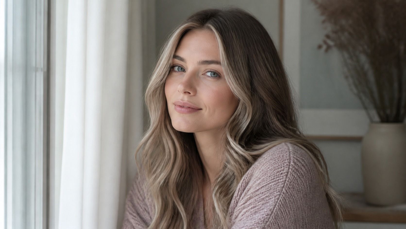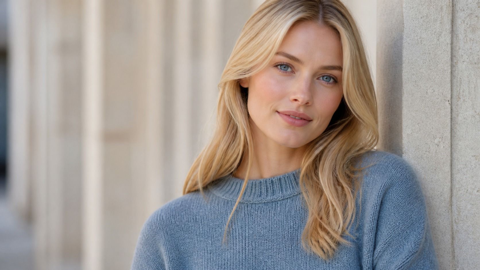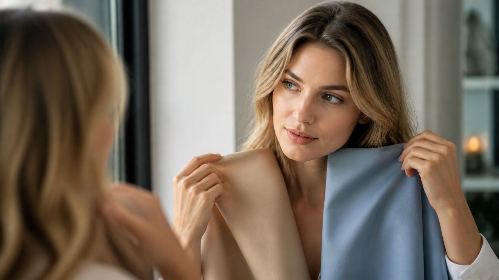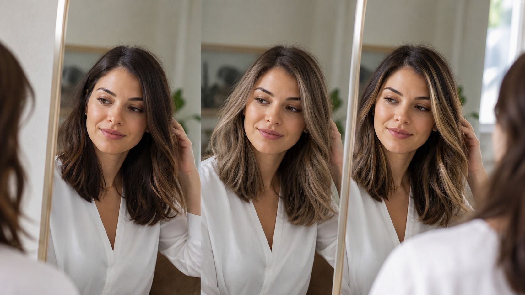
The best virtual hair color try on is not necessarily the one with the longest wall of swatches or the most dramatic before-and-after image. It is the one that lets you see a believable change against your own face, then makes it easy to compare that change without losing track of the original photo. I look for a useful preview, not a tiny piece of digital theatre.
Judge the preview before you judge the color
Start with a shade close to the hair you already have. This sounds dull, but it is the fastest quality check. Does the overlay respect the parting, the ear area and the fine hair around the temples? Does it keep a little variation through the lengths, or does it cover every strand with a plastic-looking block? If the answer is no, a flattering copper result will not become more trustworthy just because it is flattering.
Compare a realistic change instead of the prettiest thumbnail
It is easy to choose a near-white blonde or a saturated cherry red because the thumbnail has drama. The better question is whether you would be comfortable paying for the path from your current hair to that image. Going from dark brown to pale blonde may involve several appointments, a warmer in-between stage, and upkeep at the root. A virtual result usually skips that whole middle chapter.
Test a small ladder of options: your current depth, one shade lighter, one shade darker, and two temperature changes. For dark hair, compare a neutral brown with a cool brown and a chestnut before opening blondes. For blonde hair, compare beige, soft gold and a muted ash before declaring that icy silver is the answer. This makes the virtual hair color try on work like a decision tool rather than a slot machine.
| Preview feature | Useful sign | Reason to be cautious |
|---|---|---|
| Photo upload | You can use a clear daylight selfie | Only preset faces are available |
| Shade comparison | Original and saved versions stay easy to find | Each new shade replaces the last result |
| Dark-to-light preview | It shows an overall direction without pretending to show a process | It makes a major lift look instant and uniform |
| Highlights control | Brightness can be kept near the face or through the ends | Every option paints the hair as one flat color |
| Privacy choice | The image can be removed after the session | You cannot tell what happens to the uploaded photo |
After each comparison, step back from the phone. A shade can look impressive close up because of its digital texture, then look too dark or too orange at normal viewing distance. Your coworkers and your mirror will see the second version.
Use two photos when one selfie is being too generous
One photo is enough to get started. Two photos are better when you are close to booking. Take one in soft window light and one outside on an overcast day. Avoid the blue cast of late evening and the hard overhead sun of midday. If a shade looks calm and balanced in both pictures, it is worth keeping on the shortlist. If it changes from mushroom brown to greenish grey, the color may be too sensitive to the light or the rendering may be unreliable.
Use roughly the same expression. It seems trivial, but a lifted chin creates more shadow beneath the eyes and can make a darker color look stern. A wide smile changes the way you read warmth around the mouth. You are not creating a passport photo; you are removing little variables that can trick you into blaming a color for a lighting or angle problem.
Do not hide your natural brows. A hair shade lives next to them all day. If the preview makes the hair darker than the brows by several levels, ask whether you like that strong outline. If a pale shade makes your brows seem suddenly heavy, that does not mean the shade is wrong. It means you have found a detail to discuss before anyone opens a color bowl.
Test highlights differently from an all-over color
An all-over color changes the large shape around the face. Highlights are more about placement, contrast and how much of your natural base you want to keep. A single filter that turns every strand honey blonde does not answer whether a few lighter pieces around the cheekbones would be enough. For this reason, I read highlight previews as a brightness map, not an exact layout.
Try one version with softness around the face, one with light ends, and one with a darker root area. Ask which version still looks like you when the image is small. The answer is often less extreme than the first one you saved. A cool brunette with a few neutral face-framing pieces may give the lift you wanted without committing to a full blonding service.
Maintenance belongs in the comparison as well. A bright root-to-end blonde may look excellent in a preview but asks for a different calendar than a lived-in brunette with subtle ribbons. Put a plain note beside each saved image: low, medium or high upkeep. It is not a salon prediction; it is a reminder that the best-looking screen result is not always the best fit for your month.
Know when the screen has done enough
A virtual try-on earns its place when it helps you explain a preference: less gold, deeper at the root, brighter near the face, softer against the brows. It has reached its limit when you need to know whether old color will lift evenly, whether damaged ends can take more lightening, or how a toner will fade. Those are material questions, and a photo upload cannot answer them.
Bring the original photo and your two or three strongest results to a consultation. Say what you noticed, including what you disliked. "This warm brown made my skin look red" is useful information. So is "I like this lighter version, but I do not want a sharp grow-out line." A stylist can translate those observations into choices about depth, placement and service timing.
That is the modest standard I use for the best virtual hair color try on: it should leave you with better questions, a shorter list, and less temptation to make a major decision from a single polished image.