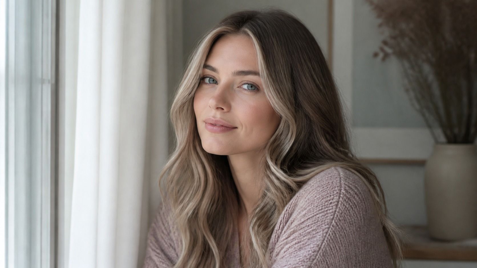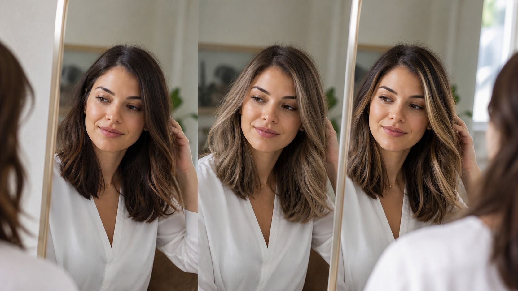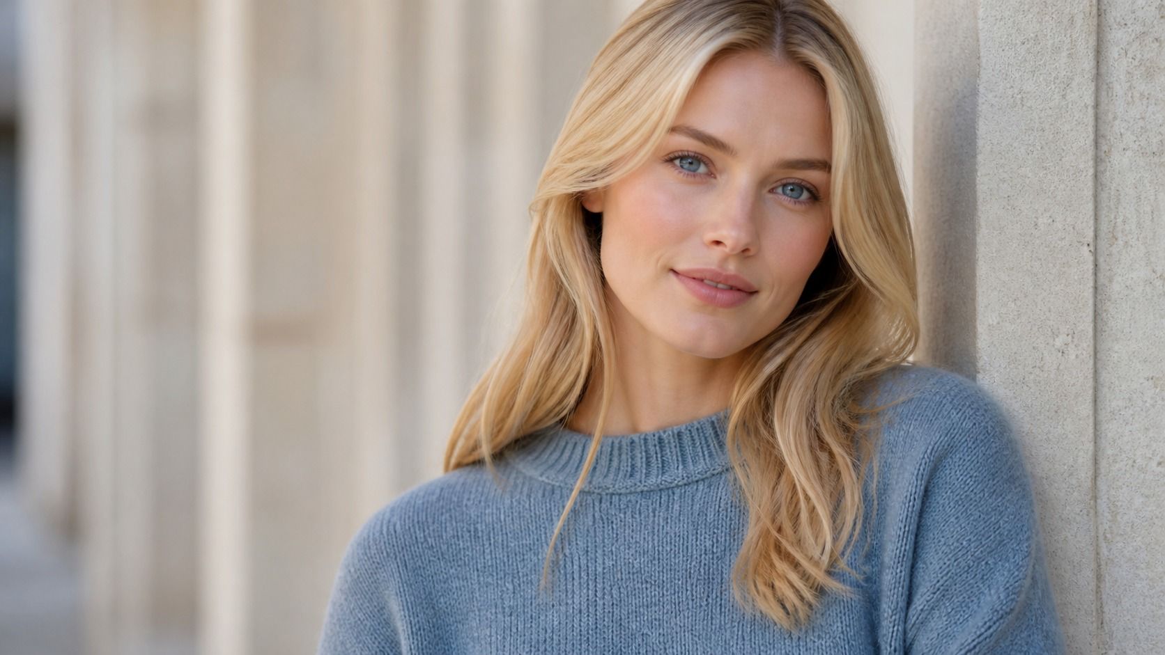
A virtual hair color try on is most helpful when you treat it as a fitting room, not a promise from the salon chair. It can show whether a shade fights your skin, whether dark roots feel too heavy, and whether a dramatic copper is more fun in theory than on your own face. It cannot predict every strand, every previous colour job, or what fluorescent office lighting will do to a fresh toner.
Begin with a photo that gives the preview a fair chance
Most bad results start with a bad source photo. Use a recent front-facing image in indirect daylight, with your hair down and your whole hairline visible. A bathroom photo under yellow bulbs may make a cool ash shade look green; a sun-blasted selfie can erase the natural depth that a colourist needs to see. Remove beauty filters and portrait blur. They are good at smoothing the very details the preview needs.
Look at the hairline before you fall for the colour
A believable preview respects the irregular edge of real hair. Baby hairs, flyaways, sideburns, and the small gaps near the temples do not form a clean helmet line. When edge masking is too smooth, even a well-chosen brunette can look pasted on. Zoom in around the forehead and ears. If the new shade stops abruptly while the original skin texture continues underneath, the rendering is doing decoration rather than simulation.
Hairline errors matter because they affect the whole impression of depth. A solid dark colour placed over a naturally light, fine hairline can make the face look harsher than it would after a careful salon colour. Root blending is especially easy for a digital preview to fake. Ask yourself whether the root seems to emerge from your scalp or has simply been painted over it. If the second answer feels closer, trust the colour direction only loosely.
Check whether highlights follow your actual hair movement
Highlights do not sit in neat, identical stripes. They break where the hair bends, disappear in the underlayers, and catch the light most strongly on the outer surface. A realistic hair color try on keeps that logic. On a wavy photo, brighter pieces should curve with the wave instead of cutting across it. On straight hair, the shine should narrow and soften toward the ends rather than appearing as a uniform pale band.
Pay attention to the parting and to the lengths around the neck. Those areas are usually darker in real life, even after a brightening service. If every strand becomes equally blonde or equally copper, the image may still be useful for broad colour temperature, but it will not tell you much about the finished technique. A colourist will need to decide placement based on density, old colour, and how often you are willing to maintain the look.
| Preview detail | Looks more believable | Reason to be cautious |
|---|---|---|
| Hairline | Fine edges and some natural irregularity remain | Colour creates a smooth cap around the forehead |
| Roots | Root depth fades gradually into the lengths | A dark band starts at exactly the same height everywhere |
| Highlights | Light follows the part and the movement of hair | Bright stripes ignore waves, layers, or shadows |
| Skin | Original texture and natural shadow remain visible | Skin and hair both look airbrushed or flattened |
| Lighting | Colour still makes sense in a second photo | The shade only works in one flattering image |
Test the shade in the light you actually live in
A salon mirror, a car window, and an office lift do not agree about hair colour. Before settling on a preview, make the same hair color try on with at least two photos: one by a north-facing window or outside in shade, and one in the indoor light you see most often. Warm home lighting makes beige blonde and copper look richer. Cool daylight can expose unwanted orange or make a grey ash look dull.
Do not expect the result to match perfectly in every image. You are looking for a shade that stays recognisably itself. If a cool brunette looks elegant in one photo and nearly green in another, it may require more careful toning than you want. If a warm honey blonde is pleasant in daylight but makes your skin look sallow under desk lamps, a softer beige version may give you an easier week-to-week result.
Notice what the new shade does to your skin, not only to your eyes
Blue or green eyes can make almost any altered hair colour feel tempting in a close crop. Step back and look at the skin around them. A too-yellow blonde can bring out pinkness around the nose; a very dark ash brown can underline shadows beneath the eyes; vivid red can make a neutral complexion look washed out even though the hair itself looks striking. These are not reasons to avoid colour. They are reasons to choose its depth and saturation with more care.
Leave the face unfiltered for this check. Makeup can make a mismatch disappear in a preview, then the same shade feels demanding on a quiet Sunday morning. If you like a dramatic result only when you add a full brow, liner, and lipstick, that is useful to know before booking. It may still be exactly what you want. It simply is not a low-effort colour choice.
Use several images and treat the result as a range
One photo can flatter a colour by accident. A small set of images is harder to fool: front-facing daylight, a three-quarter view, indoor light, and one photo where your hair is pulled behind the ears. Try the same shade family in a lighter, middle, and deeper version. This shows whether your best direction is a particular label, such as ash beige or cinnamon, or simply a temperature and depth that stay kind to your face.
Bring two or three screenshots to the salon rather than one supposedly perfect image. Explain what you noticed: you preferred the softer root, the less yellow blonde, or the version where the face did not lose contrast. A digital preview cannot know whether your previous dye will lift evenly or whether your ends need a trim. It can still make the conversation much clearer, provided you use it to describe a range of realistic results rather than demanding a pixel-for-pixel copy.