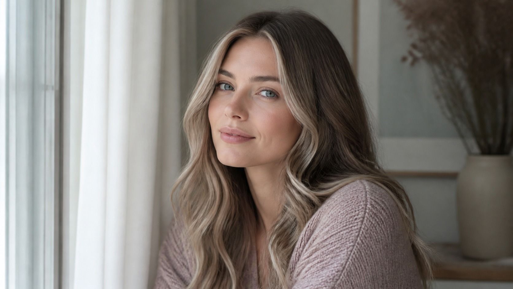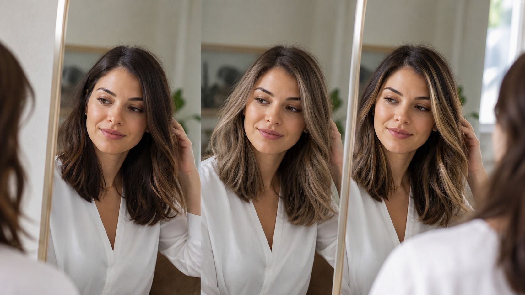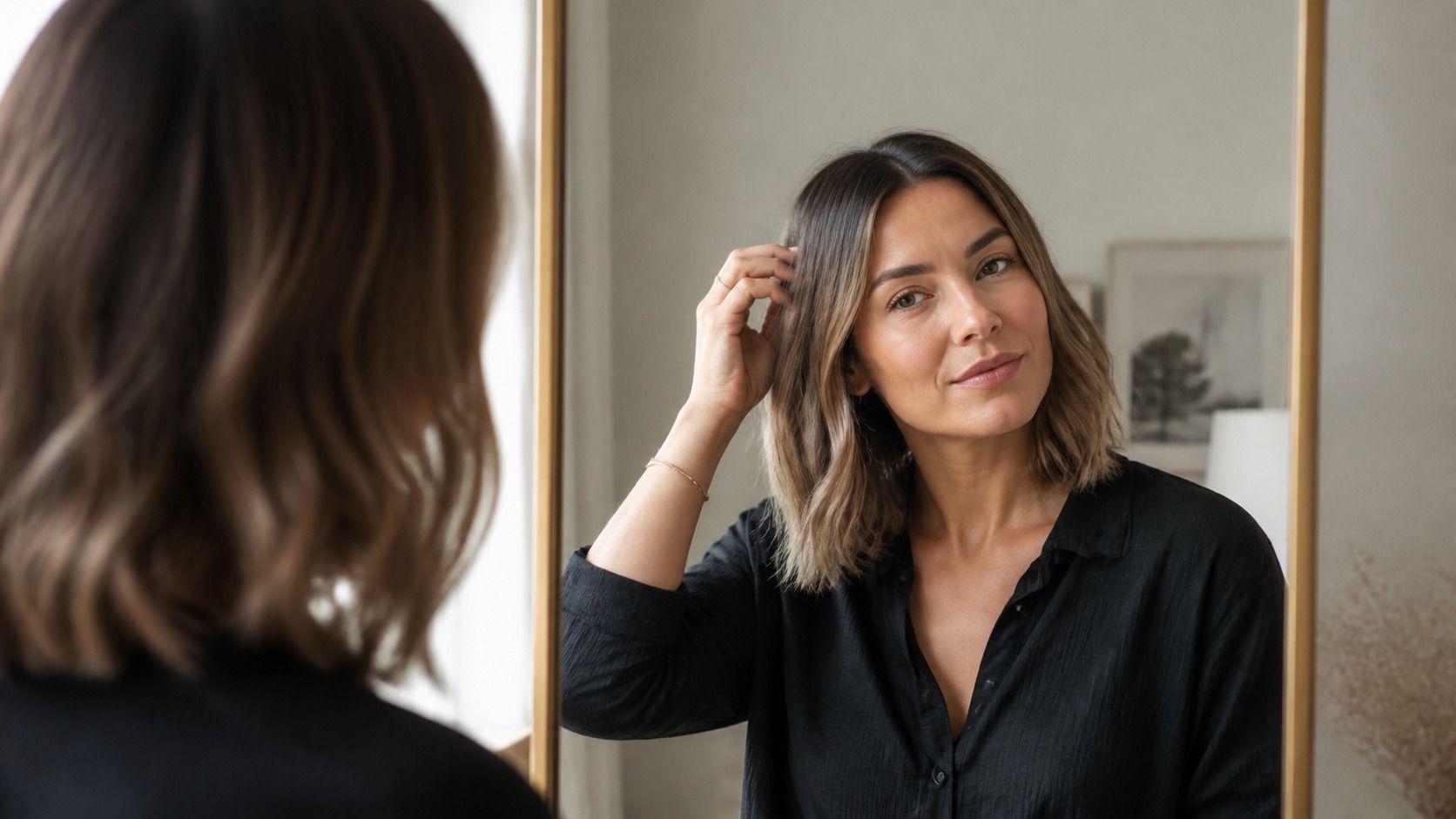
A free virtual hair color try on is most useful when you treat it like a fitting-room mirror, not a promise from a salon. It can quickly show whether ash brown makes your face look quieter, whether copper competes with your skin, or whether a darker root would feel more like you. The trick is to compare a few sensible options under honest conditions instead of falling for the most dramatic thumbnail.
Start with a photo that does not flatter the result before it begins
Choose a recent, front-facing photo in daylight near a window. Stand facing the light rather than putting the window behind you, and take off tinted glasses. A bathroom selfie under a yellow ceiling bulb can turn almost any cool brown into muddy olive; direct noon sun can bleach a warm blonde until it looks nearly platinum. Neither image gives a fair hair color try on.
Choose shades in an order that answers an actual question
Opening every swatch is entertaining for about three minutes and then stops being useful. Start with your current depth, or the closest option to it. Then test one neighboring shade that is cooler, one that is warmer, and one that is a level darker or lighter. You are looking for a direction, not trying to win a contest for the biggest transformation.
For example, someone with medium brown hair might compare neutral brown, soft chestnut, muted caramel and deep espresso. If chestnut brings out facial redness in both photos, that is a useful finding. If espresso makes the eyes look clearer but erases the hairline, make a note of that trade-off. A virtual hair color try on free tool is good at these side-by-side reactions.
| Test first | What to look for | What it can tell you |
|---|---|---|
| Closest natural shade | Whether the photo mask follows your hairline | Whether the preview is reliable enough to compare |
| Cooler version | Grey cast around the mouth and under the eyes | Whether strong ash tones may be too muted |
| Warmer version | Redness, yellowing, or extra warmth in the skin | Whether gold, copper or auburn needs restraint |
| One level deeper | Contrast around brows and eyes | Whether a darker base feels sharp or heavy |
Save only the two or three versions that still look plausible after you leave the screen for ten minutes. The immediate reaction is often just surprise. A shade that feels bold at first may look ordinary once your eyes stop comparing it to your familiar color.
Read the preview as a color direction, not a salon formula
A digital overlay cannot see what is inside the hair. It does not know whether you have old box dye on the lengths, bleached pieces around the face, mineral buildup, or a darker band from a previous color correction. Those details decide how a real color develops. The preview can say, "less golden" or "more contrast"; it cannot responsibly say, "ask for this exact formula."
Pay attention to three things: depth, warmth and contrast. Depth is how dark the shade feels beside your skin. Warmth is the red, gold or orange note that appears in it. Contrast is the gap between your hair, brows, eyes and complexion. A preview that changes all three at once can be hard to read, so return to a nearby shade before making a conclusion.
Roots deserve their own skepticism. Many filters lay one even color from scalp to ends, which looks polished on a small screen but can be costly and high-maintenance in real life. If you like the overall tone but the solid root feels severe, tell the stylist that you are drawn to the color direction rather than to a flat, one-process result.
Why every shade can look wrong in a bad preview
Most disappointing results are not really about the shade library. They come from a face that has been lit, filtered or cropped into something the tool cannot interpret. A warm lamp on one side of the room can make the left half of your hair look copper and the right half look beige. The software may then paint both sides with an oddly uniform color, and suddenly none of the choices look believable.
Check the edges around the ears, temples and parting. If the color floats over the forehead, spills onto an earring, or leaves a visible halo around the jaw, do not judge the shade yet. Retake the photo with a plain background and more space around the head. Fine flyaways are not a problem; a dark doorway directly behind black hair is.
Another easy mistake is judging only the full-screen result. Reduce the image size or look at it from arm's length. This makes the overall balance easier to see and stops you from studying pixel-level flaws in the mask. Then ask a simple question: does the color make your face arrive before the hair, or does the hair arrive first? Neither answer is automatically wrong, but it is a real preference.
Turn your saved images into a useful salon conversation
Bring two or three saved virtual results, plus one current photo taken in the same daylight. Do not arrive with twelve versions of the same burgundy. A stylist can work with a short comparison: "I prefer the softer brown in this one, but I like the brighter pieces near the face in that one." That is much clearer than saying you want the color from a filter.
Tell them what your hair has been through in the past two years: home color, highlights, toner, henna, straightening, and anything that changed the condition of the lengths. Mention how often you are willing to return and whether the grow-out line bothers you. A beautiful preview of pale blonde means little if you want to avoid regular lightening appointments.
The free try-on has already done the small but valuable job: it has narrowed a vague wish into a few visual preferences. Let the consultation handle the material reality of your hair. That division of labor is less glamorous than trusting a filter, but it is how you avoid leaving the salon surprised by a shade you only liked on a screen.
Before you close the try-on, make one small record that the app will not make for you: which photo you used and what the room light was like. A shade that looks convincing in a north-facing window may feel much warmer beside a restaurant lamp or in a car mirror. You do not need a technical color vocabulary. Notes such as better in daylight, too flat at the root, or keep the softer pieces by the face are enough. They also make it easier to return to the shortlist a week later without trusting a half-remembered screen result. If two shades are close, choose the one that still feels good in the plainer photo. The prettier image is usually the less useful judge.