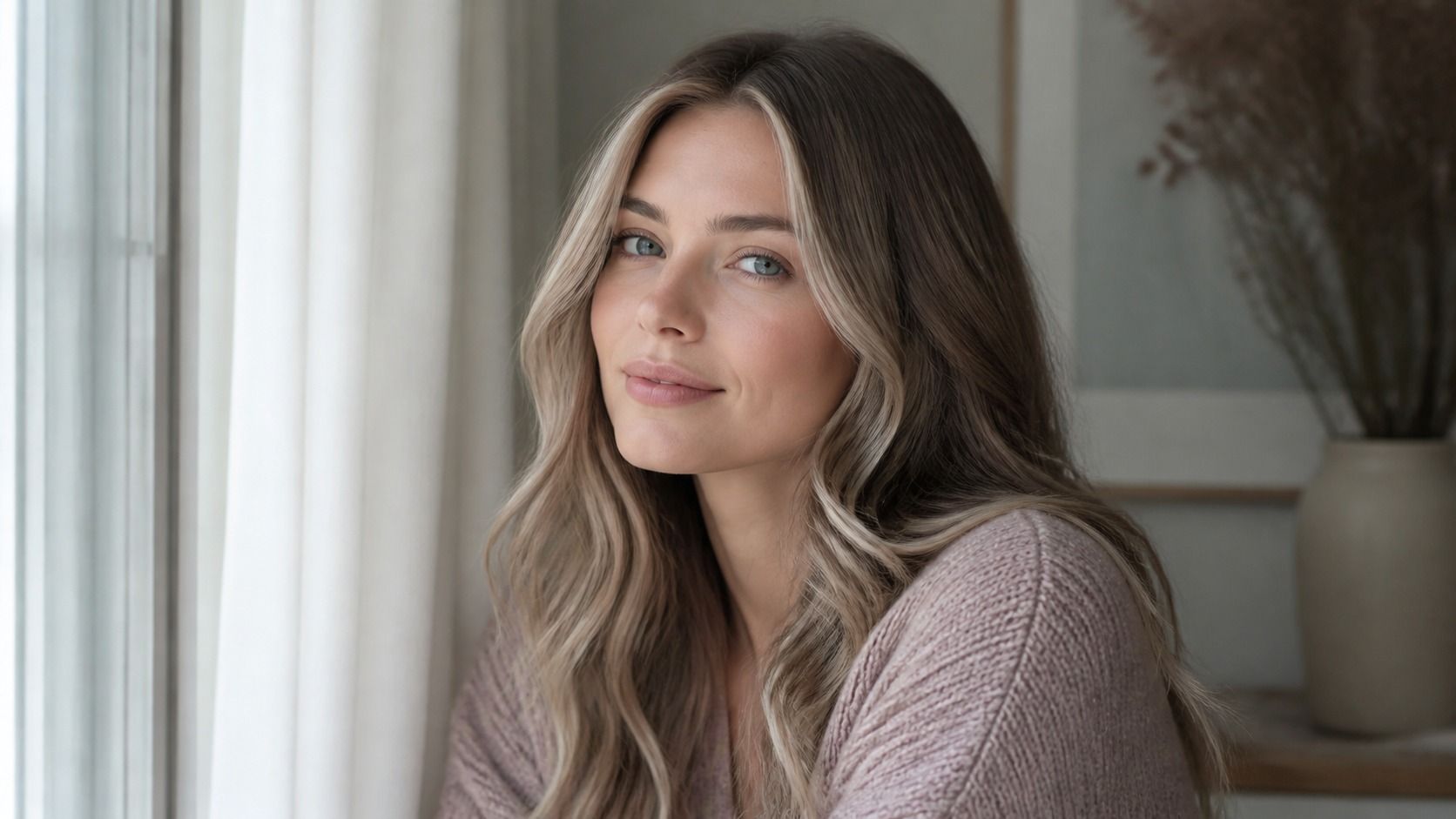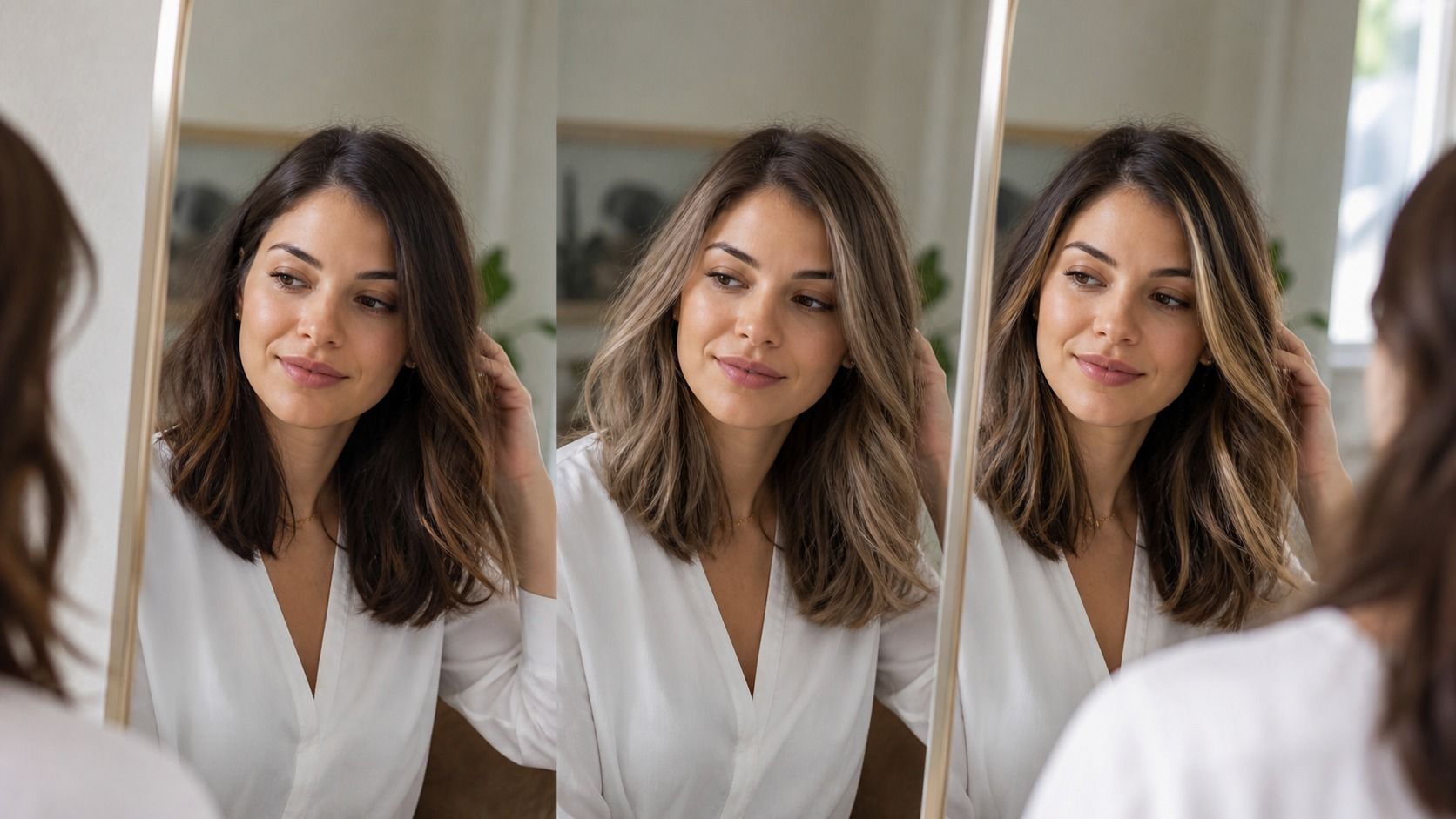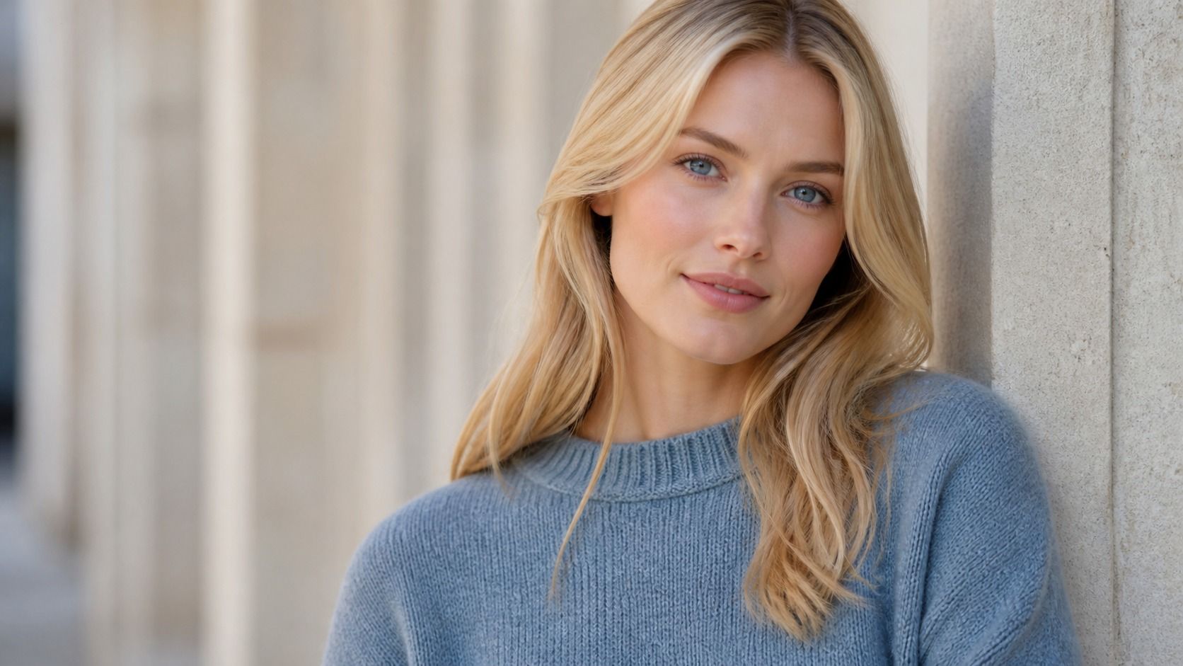
Hair color analysis is often presented as a tidy answer to a messy question: which shade will suit me? It is more useful than that. It gives you a way to notice why one brown makes the face look calm while another makes the same person look tired, and why a fashionable blonde can feel borrowed rather than natural. The framework helps, as long as nobody treats it like a verdict.
What hair color analysis is trying to answer
A good hair colour analysis looks at relationships, not isolated swatches. Your natural root colour sits beside your skin, brows, eyelashes, and eye colour every day. Change one part of that arrangement and the rest can look sharper, softer, warmer, or slightly washed out. The aim is not to find a colour that makes you unrecognisable. It is to choose a direction that does not fight the features already visible in the mirror.
Separate undertone from the colour you see at first glance
Surface skin colour changes. A summer tan, redness after a walk, winter dryness, and foundation can all alter what you notice first. Undertone is the quieter cast beneath it. Some faces read better beside yellow-gold, peach, or soft olive notes; others settle beside rosy beige, blue-red, or smoky colours. Plenty of people sit somewhere in the middle and do not need to force themselves into a warm or cool camp.
Try a simple comparison in daylight. Hold a muted gold fabric, then a soft silver-grey fabric under the chin. Watch the skin around the mouth and eyes, not the fabric itself. One may make shadows appear more obvious or make the cheeks look blotchy. The other may make the face look flatter. The useful option is usually the one that lets the face stay visible without needing extra makeup to rescue it.
Translate that observation into hair rather than labels. If soft gold helps, caramel, warm beige, chestnut, and muted copper may be worth comparing. If cool grey helps, ash brown, mushroom blonde, cool espresso, or blue-red burgundy may sit more comfortably. Neither list is a rulebook. A cool-looking person can wear warmth, but a strong orange blonde may demand more from the face than a quieter warm brown.
Use natural roots to judge depth before chasing a shade name
Depth means how light or dark the hair reads beside the face. It is often the first thing people miss when they focus on names such as mocha, bronde, or cinnamon. A colour can have the right undertone and still look wrong because it is several levels darker than the brows or much lighter than the natural root. In indoor light, a dark change can look sophisticated. By a window, it may pull the eye away from everything except the hair.
Look at the first centimetre of undyed growth near the parting. Ignore faded ends and old highlights for a moment. That root is not a command to remain there forever, but it is a useful baseline. If your root is medium brown and your brows are soft rather than dark, a near-black gloss may create a level of contrast you then have to maintain with eyeliner, stronger lip colour, or a very deliberate wardrobe.
Go one or two levels lighter or darker in a virtual try-on, then compare the face at normal size. If you only examine the hair itself, every polished digital shade can look convincing. Step back and ask whether the eyes still arrive first. That small test stops many expensive impulse appointments.
Contrast tells you how much visual weight your face can carry
Contrast is the difference between your skin, eyes, brows, and natural hair. Someone with fair skin, pale eyes, and soft medium hair often has low overall contrast. Someone with light skin, very dark brows, and deep brown eyes has higher contrast. This does not decide whether either person can be blonde, brunette, or red. It helps estimate how bold the total picture can become before it starts looking costume-like.
Make a black-and-white screenshot of a daylight portrait. Without colour, the light-dark pattern is easier to see. If the brows and eyes almost disappear into the face, a stark dark hair colour may overpower them. If the eyes and brows already form clear anchors, a deeper or clearer shade may hold its own. This check is especially useful for face-framing highlights. Bright pieces around the face add contrast even when the base colour barely changes.
| What you notice | A cautious colour direction | What to test next |
|---|---|---|
| Soft brows and low light-dark contrast | Muted beige, soft brown, gentle dimensional colour | Whether a dark root shadow makes the features disappear |
| Clear brows and deep eyes | Richer brunette, deeper red, stronger contrast near the face | Whether the shade turns too inky in daylight |
| High contrast but warm-looking skin | Deep chestnut or warm espresso rather than flat black | Whether gold tones become brassy against the skin |
| Neutral colouring with faded hair | Neutral brown or beige blonde with controlled warmth | Whether one warmer piece adds life without going orange |
Seasonal palettes are clues, not a uniform
Seasonal colour systems can be helpful because they give names to familiar patterns: muted versus clear colour, light versus deep value, warm versus cool bias. They become unhelpful when a person is told she is a certain season and must never wear another family of hair colours. Hair is more adjustable than skin, and the right cut, brow tone, and makeup can shift the balance.
Use a seasonal palette as a shortlist. A person who usually looks good in dusty rose, muted teal, soft navy, and taupe may find that smoky brown or muted blonde feels easier than bright gold. Someone who comes alive in tomato red, ivory, and warm green may enjoy golden brown or a restrained copper. The wardrobe check works because it reflects colours already tested in real life, not because the label has special authority.
There is also a difference between a permanent base colour and a temporary experiment. A cool platinum streak may be fun even if your everyday palette is warm and soft. It simply asks for more styling and may be less forgiving on a tired morning. Hair colour analysis can explain that trade-off without taking the experiment away.
Test the shade against the whole face, not against a colour ring
Salon swatches are useful for showing hue, but they do not include your eyes, forehead, jawline, or usual expression. Put two candidate shades into the same kind of daylight photo and keep the clothes plain. Look at the under-eye area, the redness around the nose, the visibility of the lips, and the point where the hair meets the temples. Those zones reveal more than a glossy length over one shoulder.
A useful test is to compare neighbouring choices rather than opposite extremes. If you like warm medium brown, test it beside a neutral medium brown and a cooler chestnut. If you like a blonde, test beige, honey, and a muted golden option at the same depth. You will often discover that the issue was not warmth or coolness at all. The colour was simply too bright, too dark, or too uniform for your natural texture.
Colour analysis hair advice is at its best when it gives you words for that observation. You can tell a stylist that you liked the warmth but not the brightness, or the depth but not the hard line at the face. That is a much better starting point than asking for a shade that looked perfect in someone else's edited photo.
Leave room for hair history and ordinary life
No framework can see through old bleach, box dye, henna, mineral buildup, or a fragile curl pattern. A flattering reference colour may need several appointments, a filler, or a gentler version to be realistic. If your ends are porous and the roots are virgin, the same formula can land differently on each part of the head. The digital preview will not warn you about that.
Bring your analysis into the salon as a direction, not a demand. Say what happened in the comparisons: cooler shades made the skin look dull, very dark shades made the brows feel too strong, or a little warmth around the face helped. Then let the strand test and the condition of your hair decide how far to go. The most flattering shade is not always the boldest one in the preview. Often it is the one you still like under an office ceiling light, in a rainy car window, and on an unstyled Tuesday morning.